What is Bluster?
Social media has pivoted from it's original intent and has become a place of hatred and unwanted opinions. It has become so bad that people are completely ridding social media from their lives.
Social media has pivoted from it's original intent and has become a place of hatred and unwanted opinions. It has become so bad that people are completely ridding social media from their lives.
Social media catapulted with the creation of MySpace. It began as a place where friends could hang out virtually and share their lives with each other. It was a promising idea that had good intentions. However, social media today is much different than the initial concept. In 2020, social media is flooded with people’s opinions, friend requests from strangers, and of course people highlighting their “perfect lifestyle” leaving you feeling inadequate. People are tired of what current social media platforms have to offer. Bluster brings social media back to its original glory.
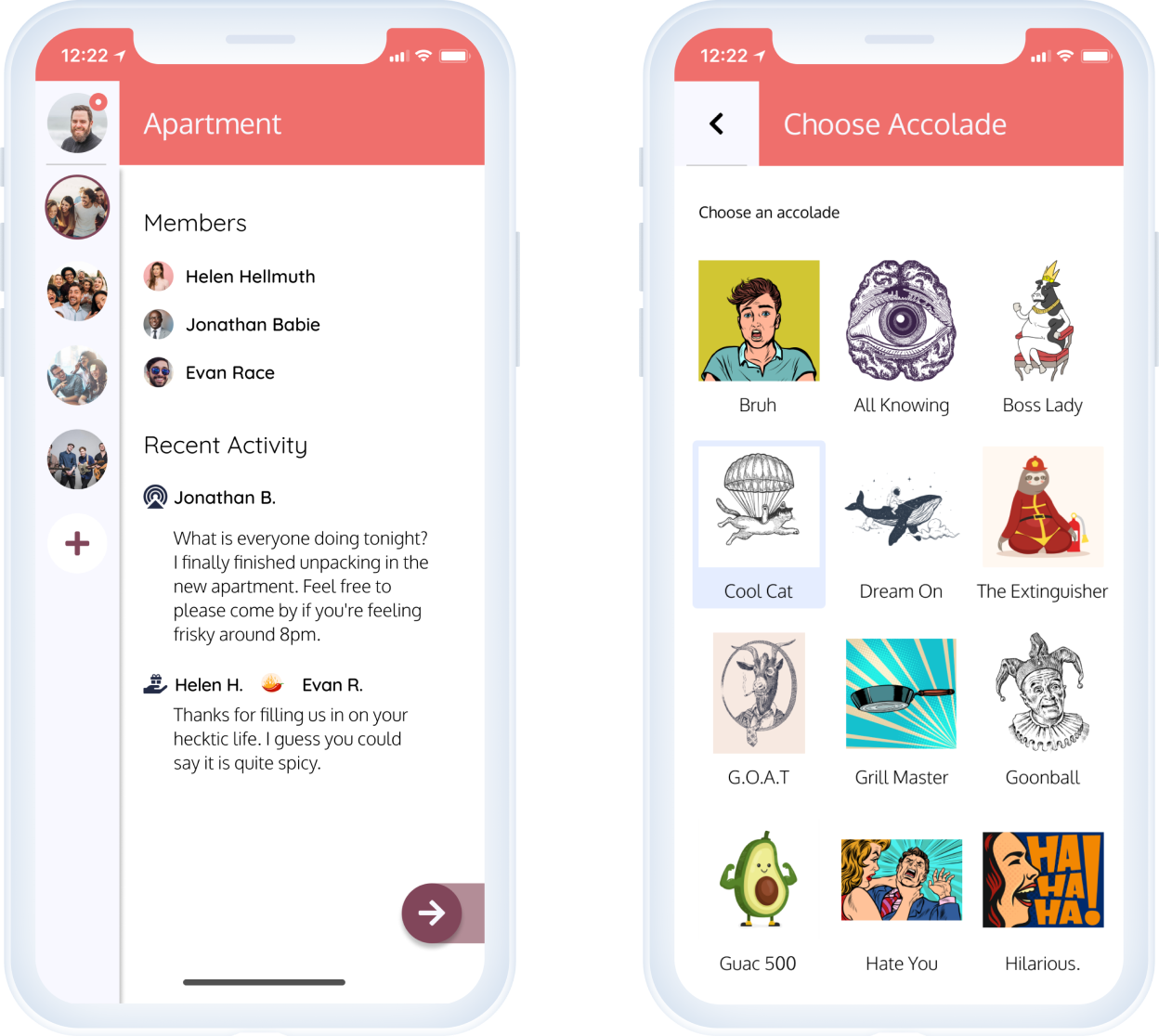
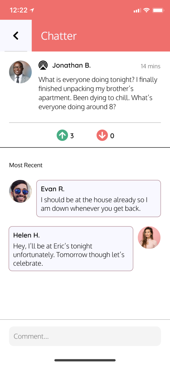
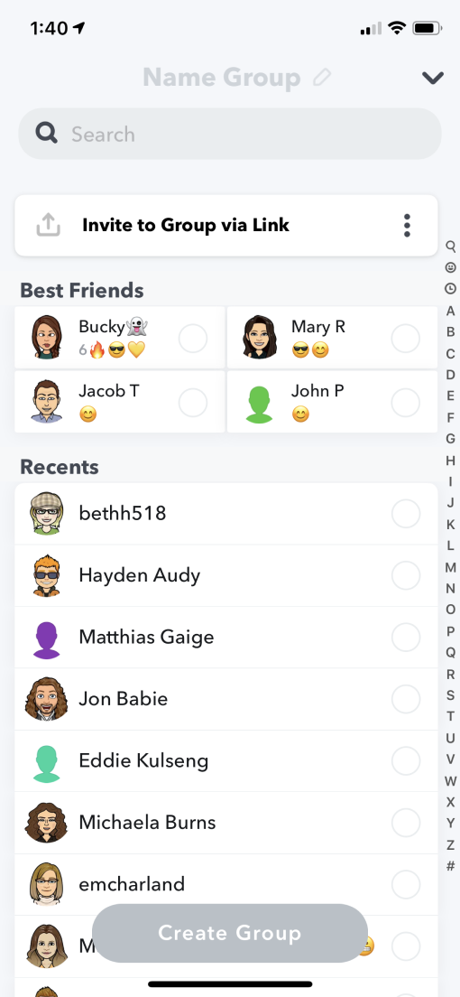
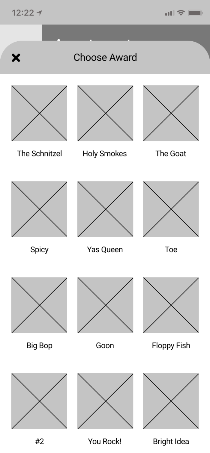
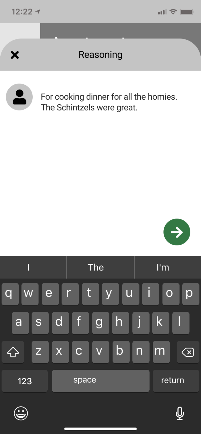
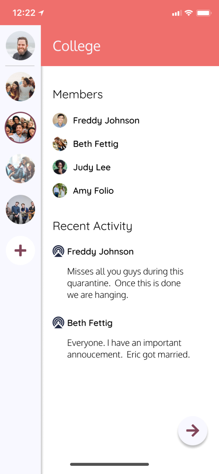
The goal of Bluster is simple - send broadcasts to your group of friends, your actual friends, and award those friends for their achievements.


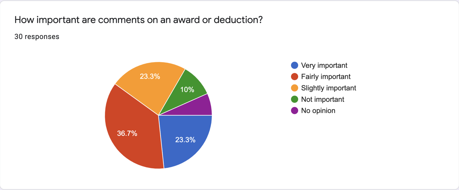
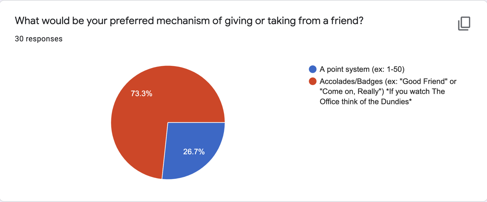
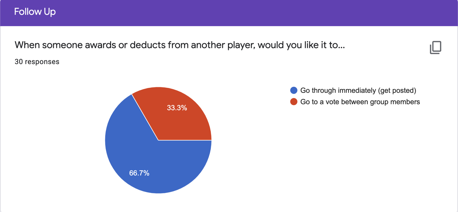
I began with a user survey that was sent out by email. I collected over 30 responses and gathered the following results:
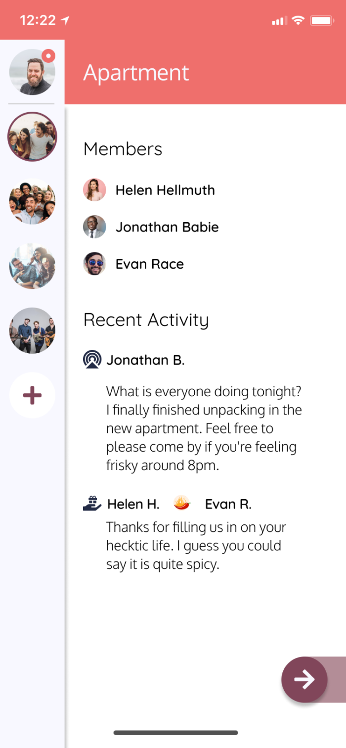
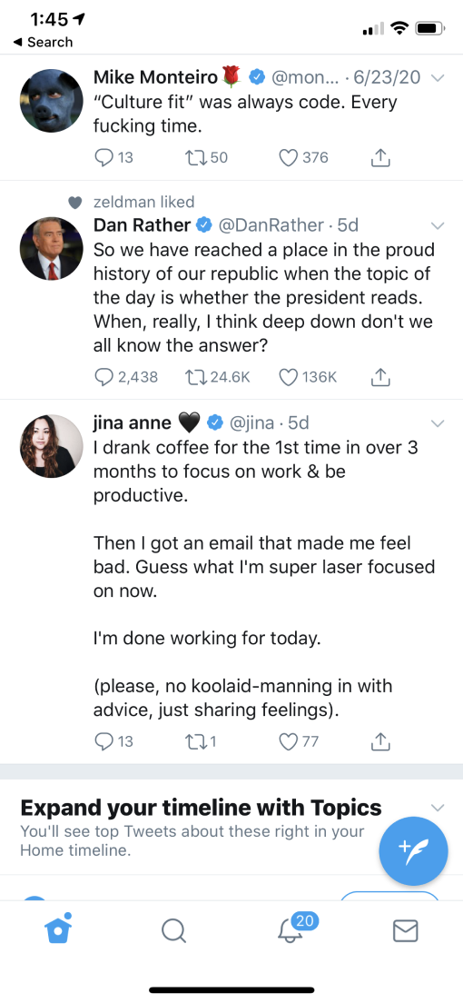
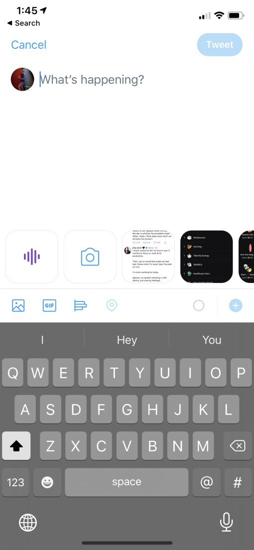
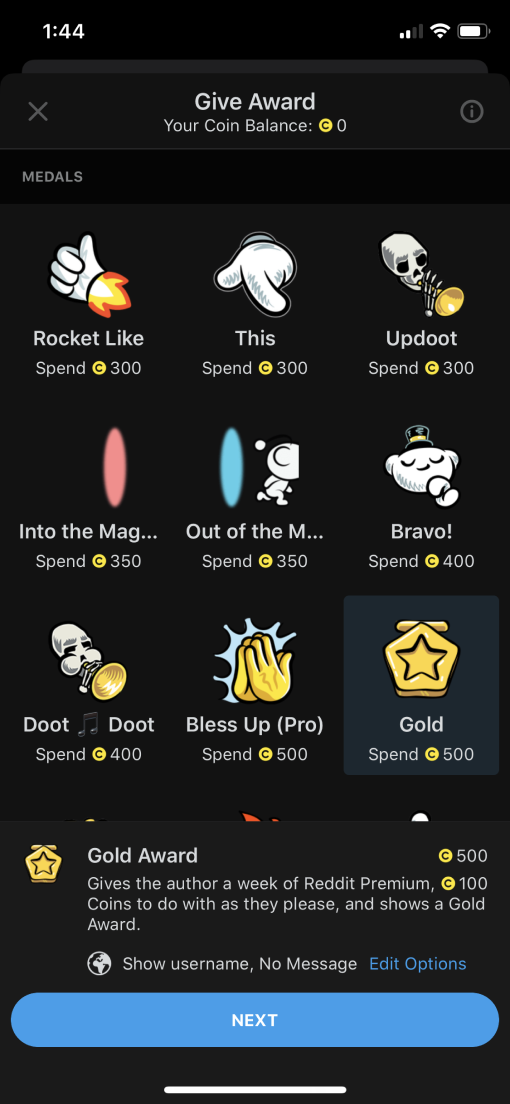
Competitive analysis was performed on Snapchat, Twitter, and Reddit. Snapchat was chosen because it is an app primarily used between true friends, as opposed to a competition of likes. Twitter was chosen for the way users can publish tweets to their followers. Lastly, Reddit was used because it has an award system built into the application. I wanted to look into the specific flowpath users had to go through in order to award posts.
Three different personas were created to define the scope of the project. All personas intentionally share similar interests because Bluster is a social platform used among friends.
“ I am kind of the clown in my group. I enjoy busting on them just as much as they enjoy busting on me. It's all in good fun”
“My friends are my life. I love them all dearly and I wish I could find a platform to let them know how proud I am of them. ”

“I am adjusting to life across the country. I miss my friends and family and wish we could feel like we are still hanging out.”
With the research phase now complete, it is time to sit down and determine the absolute needs of the users.
high priority
Medium priority
Low priority
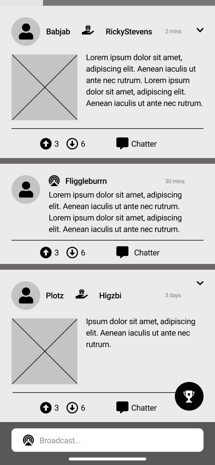
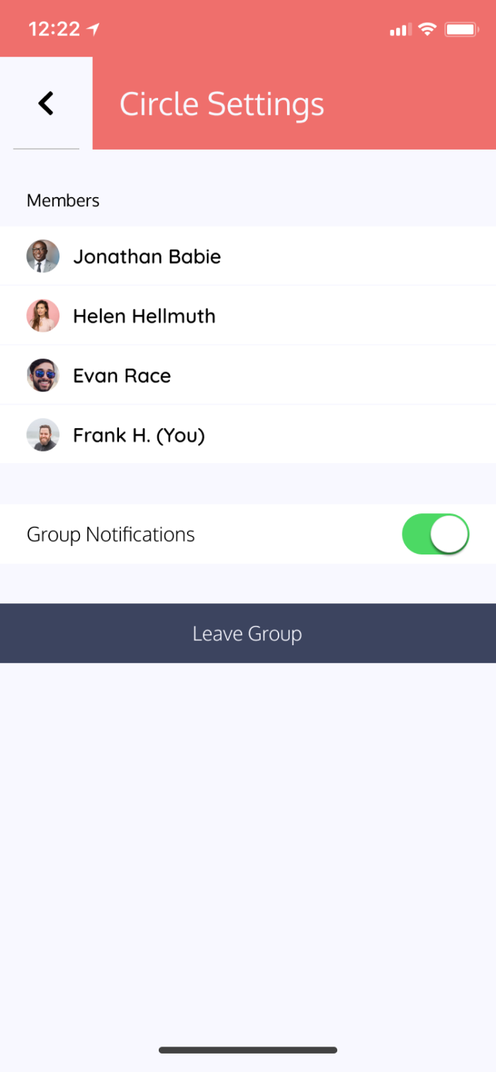
User flows were created for every possible scenario that a user could take. These included broadcasts, award posts, leaving groups, and more.
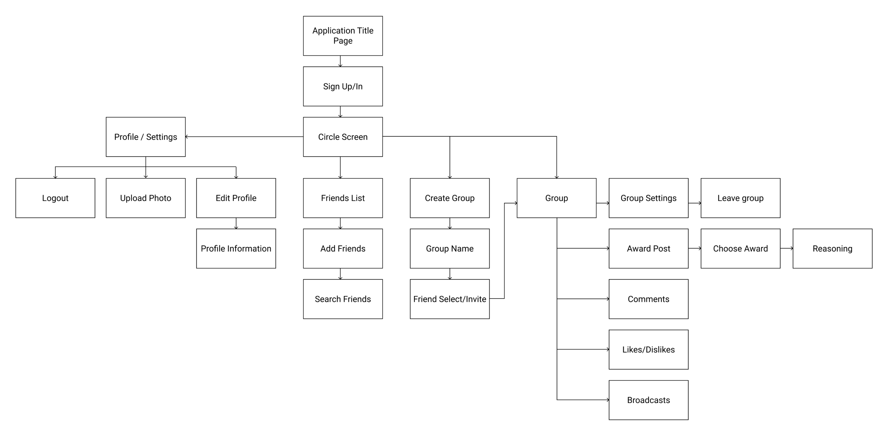
A site map was needed before moving to visual design. There was not a ton of moving parts because Bluster is a social media application based around private groups. However, it was important to continually look back at the site map to make sure I was staying on track.
Branding, in my opinion, was arguably the most important piece of this application. It had to be an application that a diverse group of people would feel comfortable using. It could not come off too childish or too professional, potentially limiting the diversity of the audience.
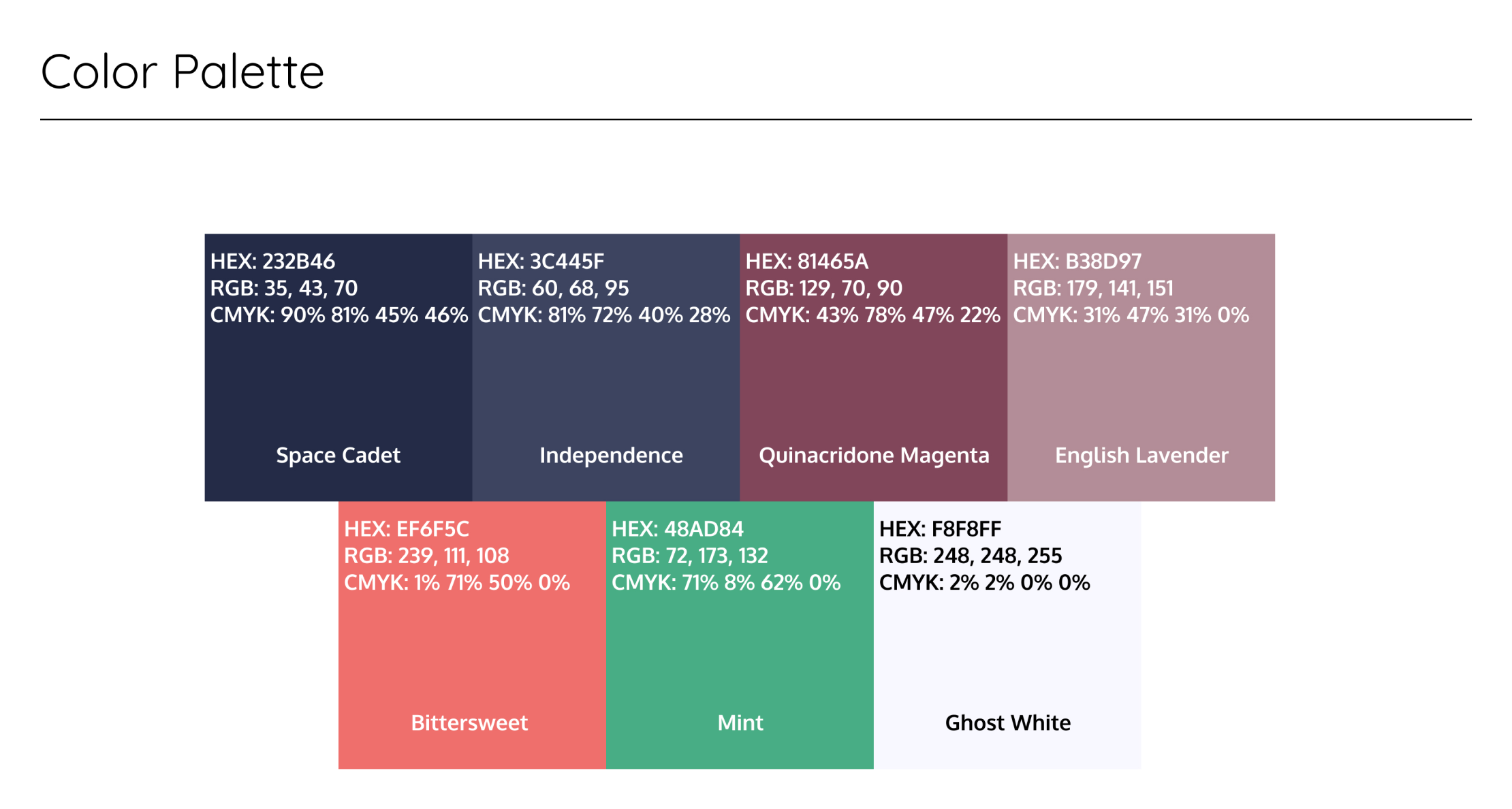
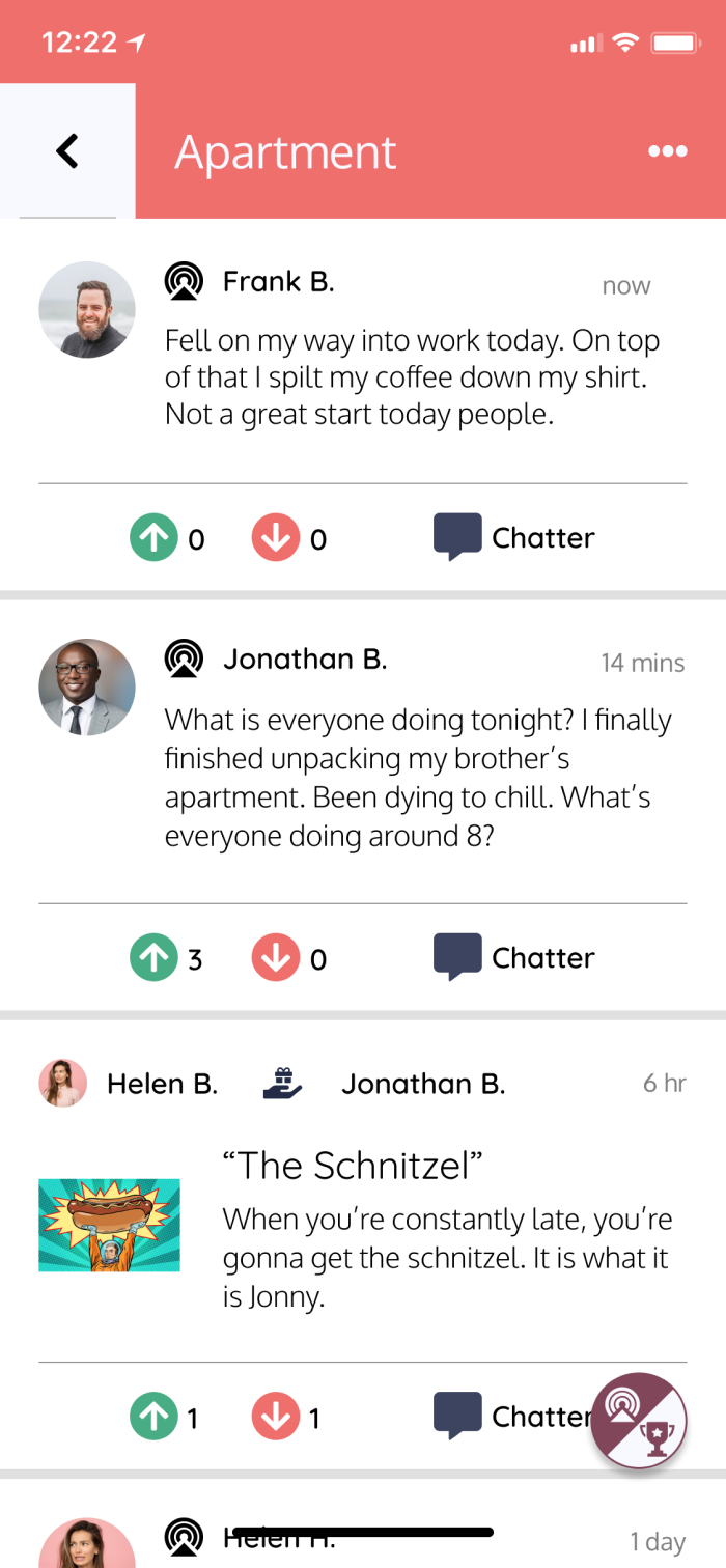
The color palette I chose is relaxing and reflects the mood of the brand. Bluster is an application that deals with your closest friends and awarding those friends for their actions. Users may choose to sarcastically award accolades or genuinely compliment their friends. I chose dark blue, orange and magenta as the main colors to reflect the diversity of the app. The blue represents trust and loyalty among close friends. The orange expresses creativity. The main goal of this application is to give awards for whatever the user sees fit, and undoubtedly there will be some creative reasons. Lastly, the magenta rounds it out with compassion and a sense of respect. At the end of the day, these are your best friends and you will be sharing moments with one another over a period of time. It gives the user an opportunity to look back at those moments and remember past events they may have since forgotten.
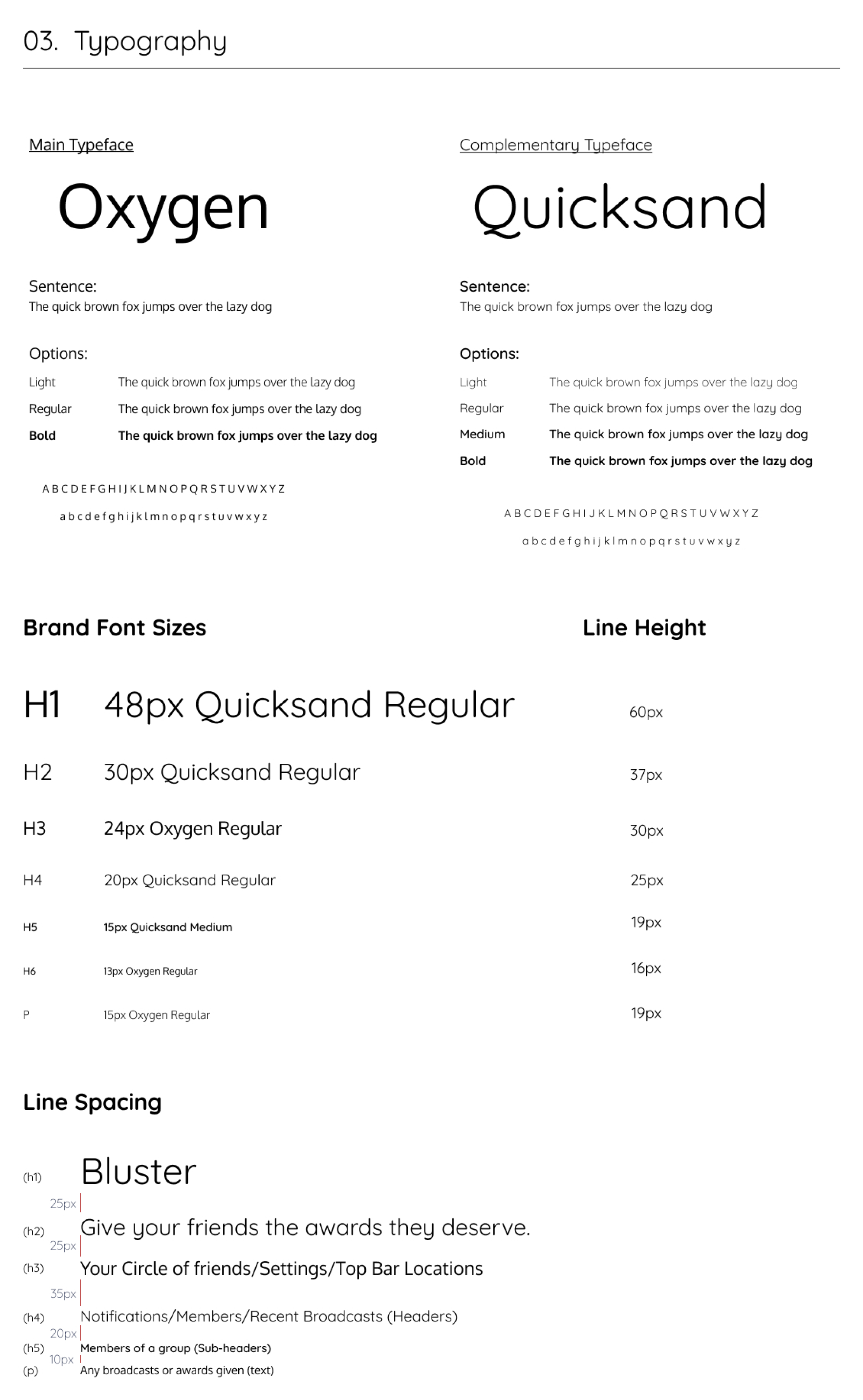
I chose two different fonts that fit the brand and its mission. I wanted an easily legible font for the main typeface; however, I wanted an easy-going, fun font for some titles and subheaders. I found pairing fonts Oxygen and Quicksand were a great combo that checked all of my boxes.
It took me a while to figure out what I wanted to name the application. I wanted something short and memorable, and most importantly not taken on the app store. That is when I stumbled across the word “Bluster.” The definition of Bluster is “to talk in a loud, aggressive, or indignant way with little effect.”
A style guide was created to showcase the brand and give other designers a template to ensure brand consistency.
Style GuideBringing my ideas to life was the next step. I drew out pages upon pages of different screen designs that I thought were intuitive. I struggled with a few screens, particularly the group selection screen. I completed several rounds of A-B testing on these screens to solidify the preferred design. Luckily, some of my close friends are web developers and I was able to ask for their opinions and draw from their experiences. This counsel was invaluable and it helped shape the final design of the wireframes.
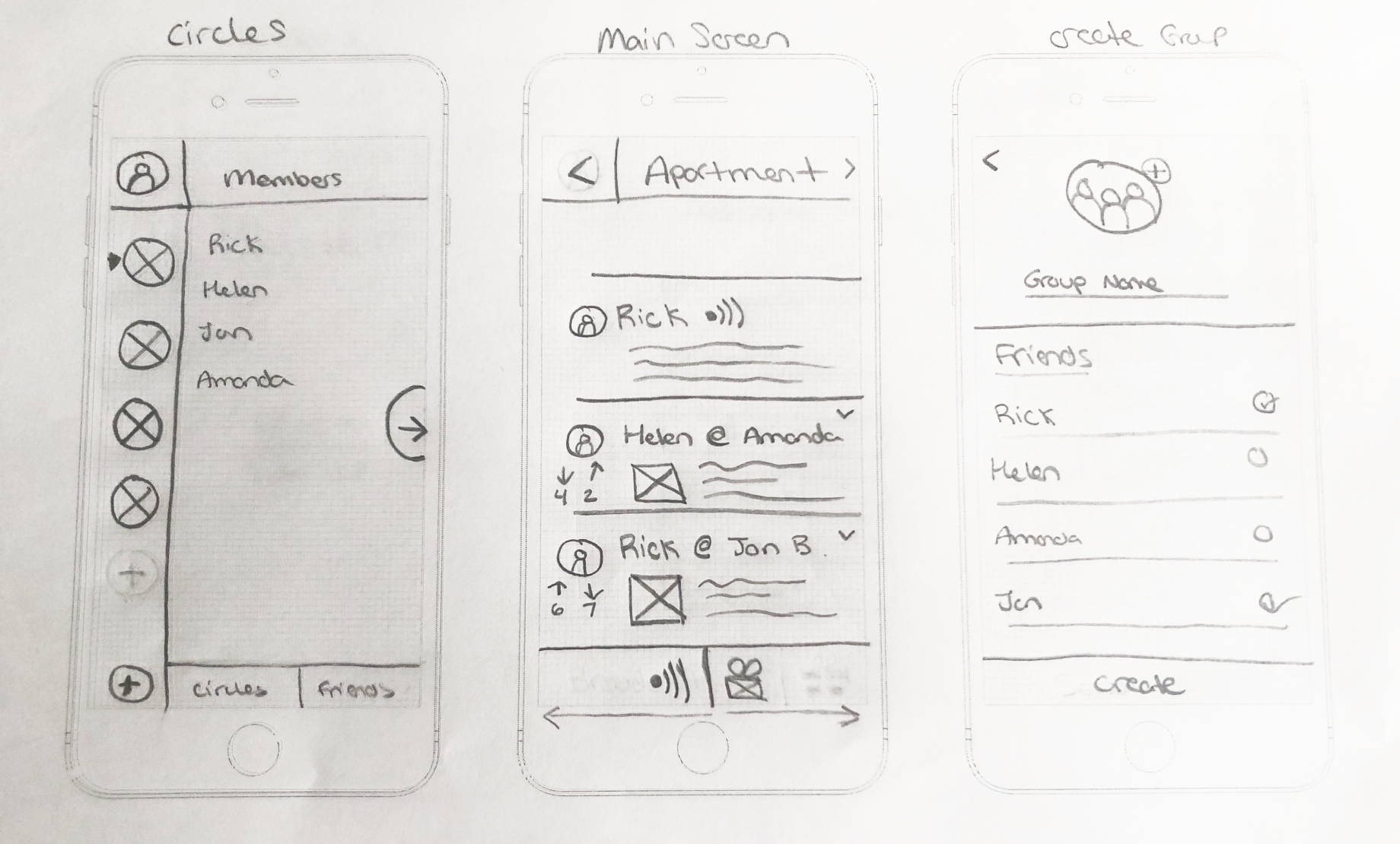
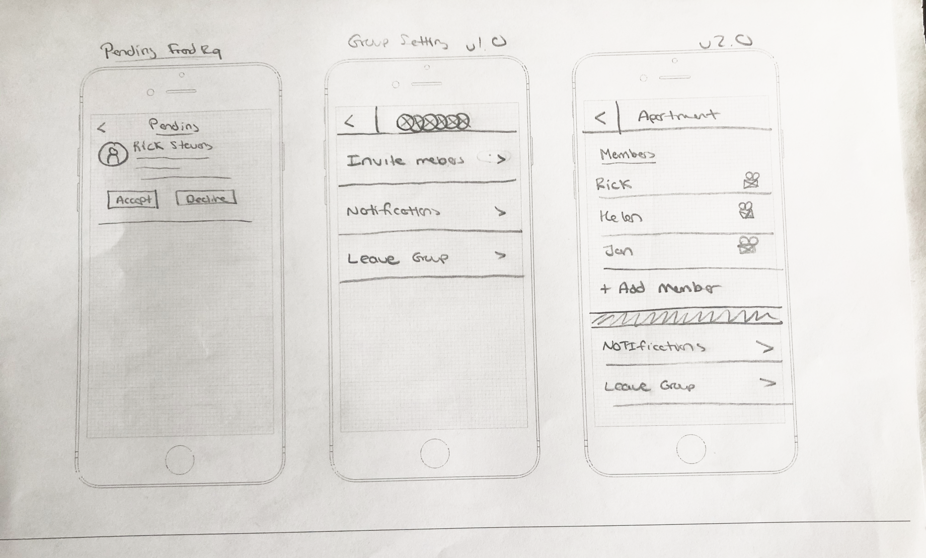
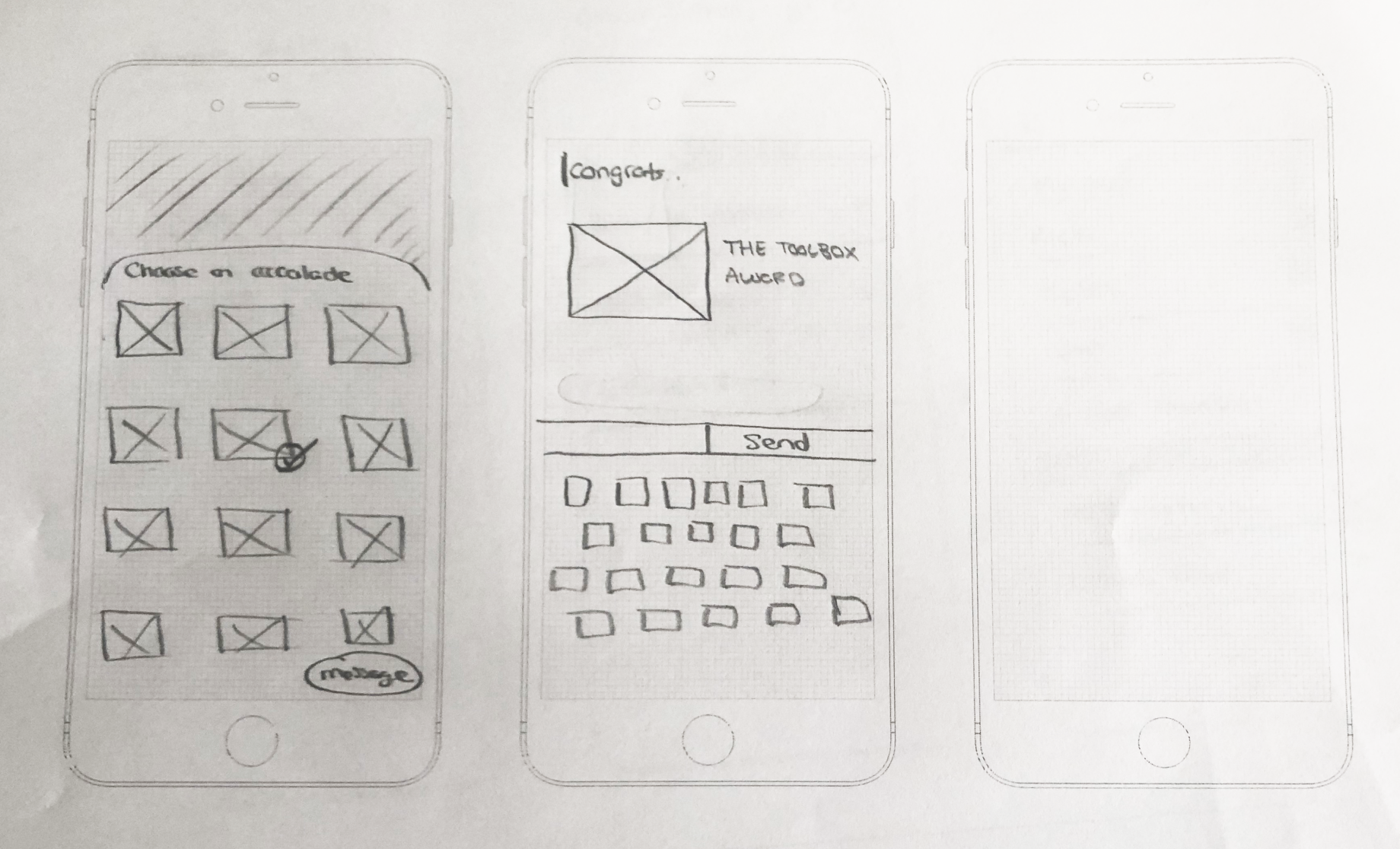
Once the sketches were complete, I created low fidelity wireframes. These frames were important because I planned to run a “paper-prototype” to see if the application flow was smooth.
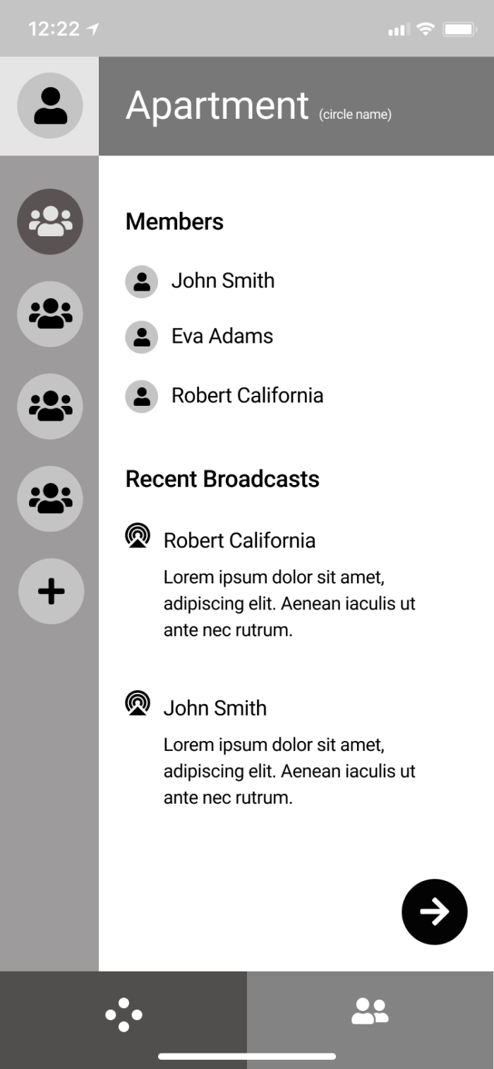
I performed a general round of user testing using the low fidelity wireframes as a paper prototype. My goal was to determine if the layout was intuitive before creating high fidelity mockups. The biggest improvement that came out of this was the removal of the bottom tab bar between the Feed Overview and the Friend’s List. User testing data revealed that once users created their initial groups, the need to go to their Friend's List greatly decreased. This opened up more space on the main screen and improved the overall feel of the application.
With the wireframes finalized, I moved on to the high fidelity mockups. This is when Bluster finally came to life. During this phase, I implemented all the necessary changes from the low fidelity wireframe testing.
I went through three rounds of high fidelity user testing, each round building upon the last. Each user test unveiled valuable information that shaped the final design of Bluster. The tasks given to the testers were as follows:
In my initial mockups, my inactive and active buttons were too similar. Users did not register the change, and they thought they were doing something incorrect. I overhauled the buttons to create greater contrast which proved successful in later testing.
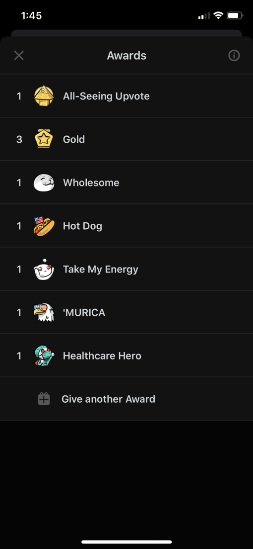
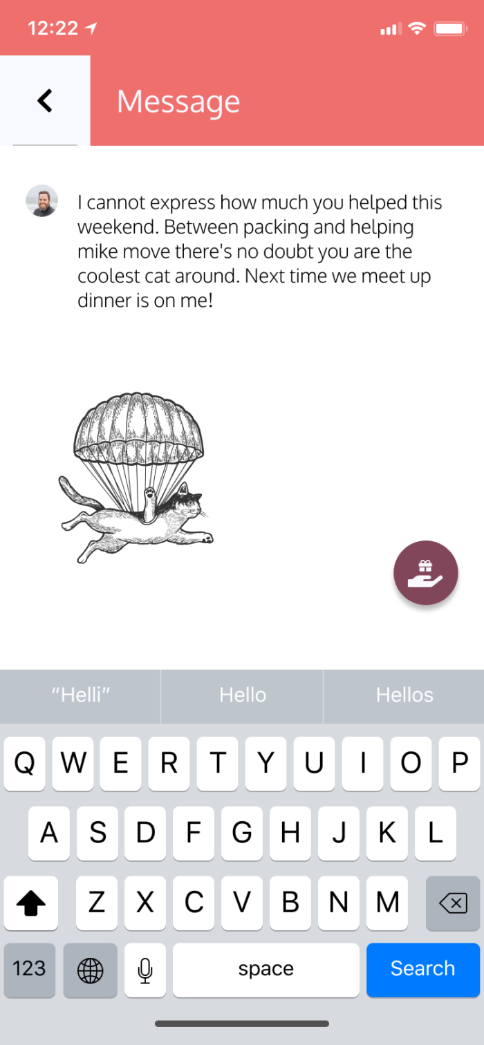
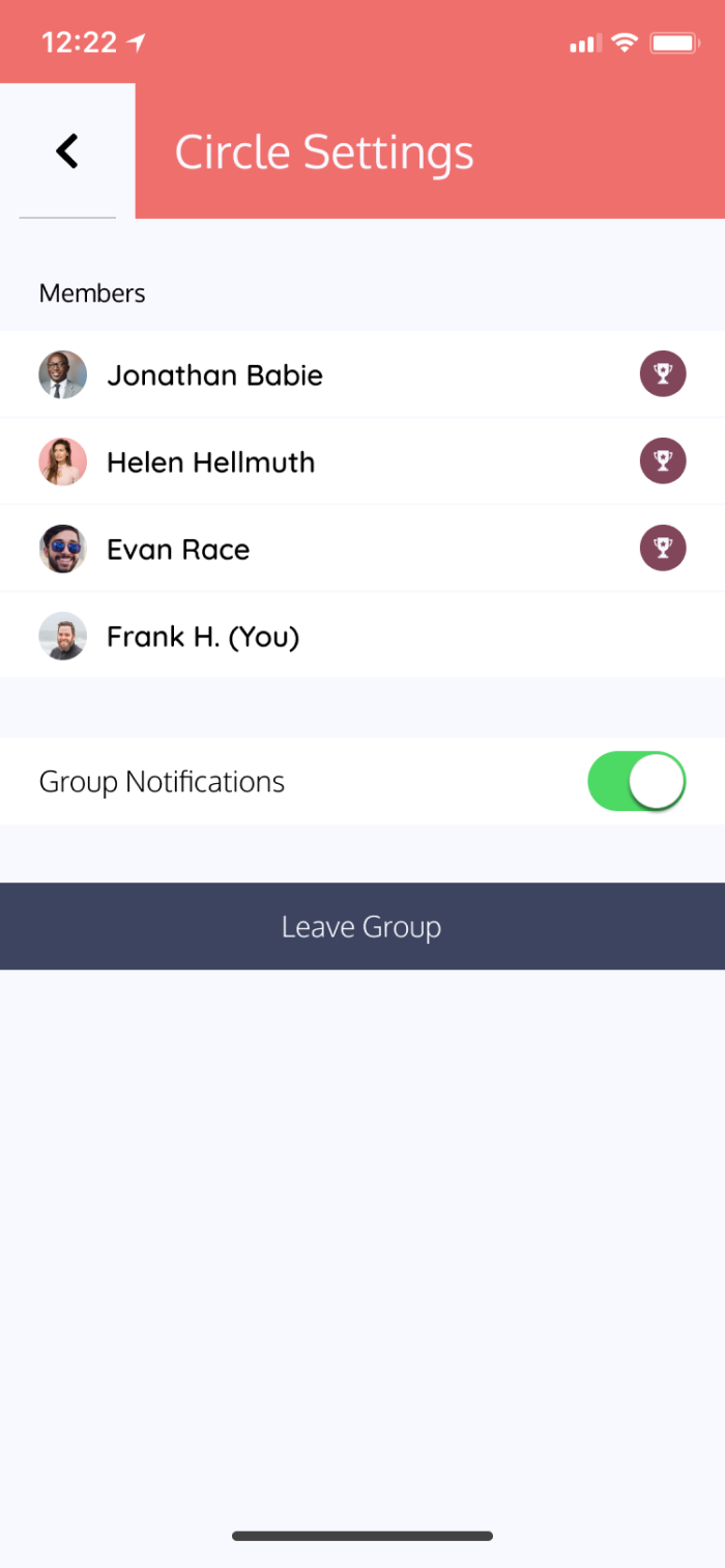
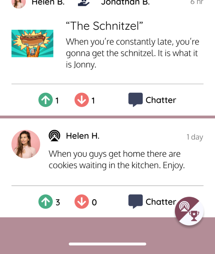
When awarding accolades to friends, I noticed that some testers would use the dedicated “award” button, but other testers would go into the user settings and try to click on the member they wanted to award. I created a second path a user can take to award accolades to their friends. This allows users to award their friends through different pathways, which enhances their user experience.
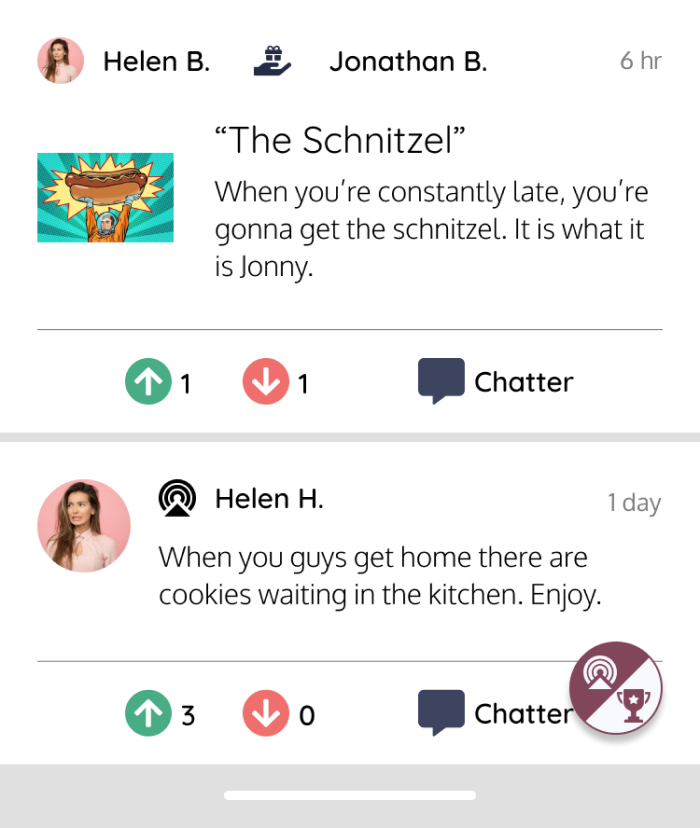
I originally used a brand color as the feed background. This looked good to me, but it was causing contrast issues. The award/broadcast button was getting lost in the background of the feed causing users to overlook the button. Once I changed the background color to grey, users tended to find the button with ease.
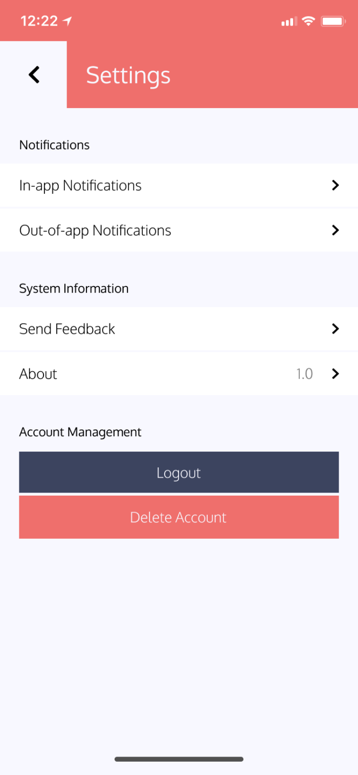
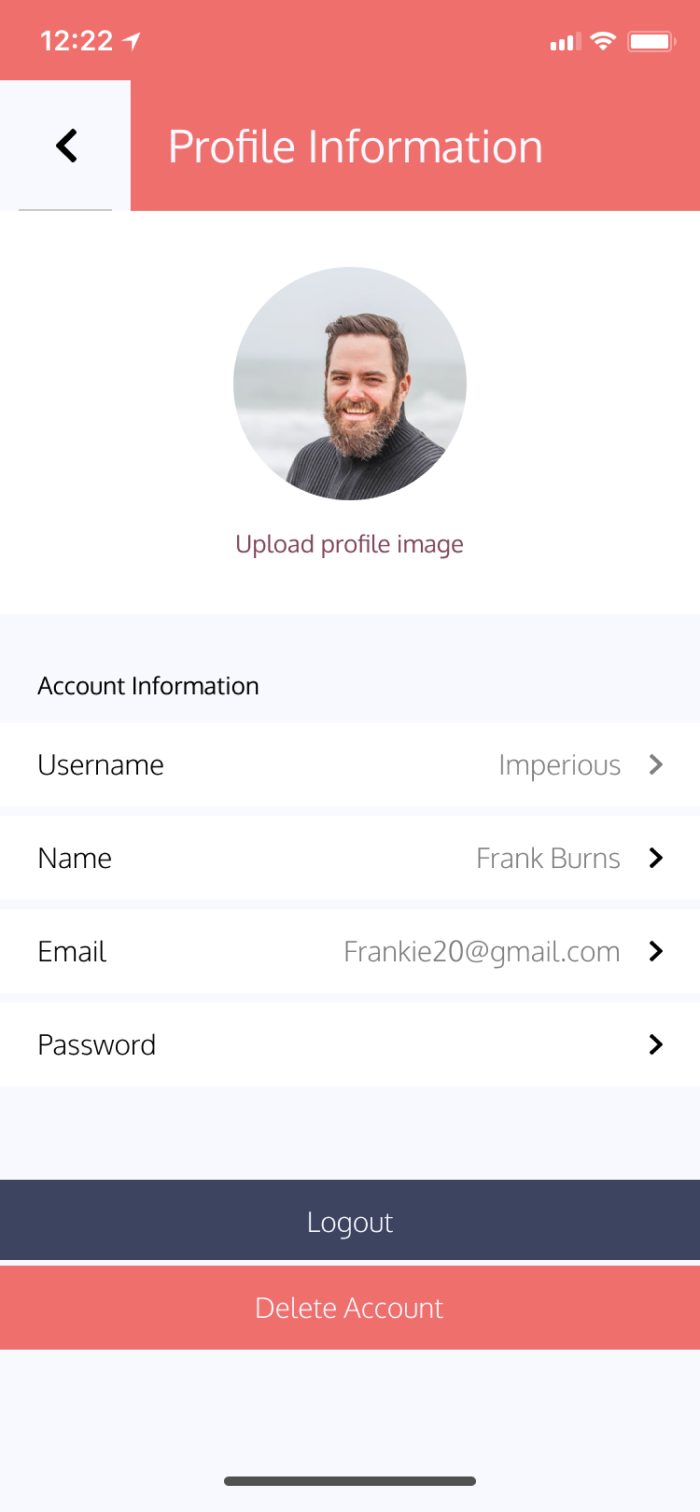
The last big issue to address was the location of the logout button. It seemed that every user had a different idea of where this button should be tucked away. I originally had it in settings, but then a user clicked on profile information to logout. Thus, I then moved the logout button into profile information and thought that would resolve the issue. In the following user test, the user tried to logout via settings rather than profile information. Another user thought that it should be in the sidebar navigation and not in profile information or settings. Essentially, every person had a different idea of where this button should go.
I had a blast working on this project. As someone who used to enjoy social media and now I cannot stand it, it was fun to come up with a solution to make it exciting again. The survey at the beginning of this project helped shape the entire scope of the application. People want to enjoy social media, but options today are bloated with features and content. People want to create memories with their true friends, not hundreds of “friends” on other platforms. On top of that, people want to incentivise conversation by awarding their friends for a plethora of reasons. Some people want to be sarcastic, while some want to be genuinely kind. The beauty of it is that you are with your true friends. I believe Bluster is the solution to make social media fun again.
If given more time, I would love to do more user testing. I think that people in my survey enjoyed the idea of awarding their friends accolades. However, I would like to see how often that feature is used compared to
a broadcast. It would also be interesting to know if an API could be used for GIF functionality.
Bluster is an application that makes people think differently about how they use social media. In recent times, people have grown tired of the tech giants. Between negativity, privacy concerns, and self-image issues, it makes sense that people are looking for something different.